March 29, 2019
Abstract
This project tries to shed light on the relationship between Life Expectancy, Electricity Consumption per capita (in kWh) and GDP growth per capita (in Y2000 $) for around 84 countries. The purpose is to understand whether human life expectancy in years is positively correlated with energy consumption and GDP growth. The question is whether more industrialized nations which have on average higher energy consumption and higher GDP per capita also have higher life expectancy.
This hypothesis appears obvious but having actual data to support it will be very helpful. Governments in developing and emerging countries like India, China and African nations can use such type of analysis for energy infrastructure planning and economic development. Better energy infrastructure leads to higher economic activity and more economic activity will create demand for more energy production and the cycle goes on leading to higher life expectancy. This positive correlation is explored in this project using various visualization techniques. Population of the various countries were also plotted. Different visualization techniques were used to represent this multivariate data to understand trends. War leads to reduction in life expectancy and this is quite stark in the case of Libya and Syria in the recent years.
Data
The GDP, Electricity consumption, Life Expectancy and world population data were obtained from Gap Minder website https://www.gapminder.org/data/. Country continents and ISO codes were obtained from Wikipedia. There were a lot of missing data in the files which resulted in a lot of cleaning being performed. R has been used for all the cleaning and combining operations leading to one final data frame . Out of the 195 countries in the world only 84 countries had continuous GDP, Electricity Consumption, Life Expectancy and Population data from 1981 to 2011.
rm(list = ls())
library(plotly)
library(tidyverse)
library(shiny)
#library(shiny)

elec_consumption_df <- read_csv("ElectricityConsumptionPerCapita.csv")


elec_consumption_df <-  elec_consumption_df %>%
  rename("Country" ="Electricity consumption, per capita (kWh)") %>%
  select(-c(colnames(elec_consumption_df)[2:22]))
Reading in the dataset which has Countries and Continents.
country_df <- read_csv("GPW3-GRUMP_SummaryInformation_beta.csv") %>%
  select(c('CountryEnglish','ContinentName')) %>%
  rename('Country' = 'CountryEnglish',
         'Continent' = 'ContinentName')
Reading in the GDP per capita dataset
gdp_percap <- read_csv("GDPpercapitaconstant2000US.csv")
gdp_percap <- gdp_percap%>%
  select(-c(colnames(gdp_percap)[2:22])) %>%
  rename("Country" = "Income per person (fixed 2000 US$)")
Population of various countries are read in from the following dataset
population_df <- read_csv("population.csv")
population_df <- population_df %>%
  select(-c(colnames(population_df)[c(2:47)]))
population_df <- population_df %>%
  select(-c(colnames(population_df)[33:46])) %>%
  rename("Country" = "Total population")
Country codes (three letter codes) along with continents which are required for choropleth maps.
country_code <- read_csv('country_code.csv') %>%
  select(-c(X1,"GDP..BILLIONS.")) %>%
  rename('Country' = "COUNTRY")
country_code2 <- read_csv("country_code_continent.csv") %>%
  select(-c(Country_Name,Continent_Code,Two_Letter_Country_Code,Country_Number))%>%
  inner_join(country_code,by = c("Three_Letter_Country_Code" = "CODE"))
Finally reading in the life expectancy in years for various countries from gapminder.com
life_exp <- read_csv("life_expectancy_years.csv") %>%
  rename("Country"='country') %>%
  select(c(1,183:220)) %>%
  na.omit()
life_exp_p <- life_exp

life_exp <- life_exp %>%
  select(-c(33:39)) %>%
  na.omit()
Some amount of data cleaning is required. Removing NA from the data frames.
gdp_percap <- gdp_percap %>%
                 na.omit()
elec_consumption_df <- elec_consumption_df %>%
                          na.omit()

population_df <- population_df %>%
                      na.omit()
All the datasets with the exception of Country codes are in the wide format. Inorder to perform any kind of plotting in Plotly this needs to be converted into the long format. A new data frame with data from each of the datasets need to be created with columns of Country, Continent, Country Code, GDP, Year, Population, Life Expectancy etc. Tidyverse offers the gather function which uses key value pairs to create the long stack from the wide stack.“common_countries” data frame was created to find the countries which are common among all the datasets. This reduces the number of countries to 84.
common_countries <- country_code2 %>%
  select(Country)
common_countries <- common_countries %>%
                     # intersect(country_df %>% select(Country)) %>%
                      intersect(elec_consumption_df %>% select(Country)) %>%
                      intersect(gdp_percap %>% select(Country)) %>%
                      intersect(population_df %>% select(Country))
Turkey and Cyprus are listed twice belonging to both Europe and Asia.
country_code2 <- country_code2 %>%
  filter(!(Country=='Turkey' & Continent_Name =="Asia")) %>%
  filter(!(Country=='Cyprus' & Continent_Name =="Europe"))
Adding 3 letter country codes to life expectation data frame and stacking the year columns vertically using gather. More explanation given below.
life_exp_p <-   life_exp_p %>%
  inner_join(country_code2,by="Country")

life_exp_p <- life_exp_p %>%
  gather(Year,life_exp,"1981":"2018")
Since the datasets are from different sources, there are some countries missing or don’t exaclty match
country_code2 <- country_code2 %>%
  inner_join(common_countries,by="Country") %>%
  unique()

elec_consumption_df <- elec_consumption_df %>%
  inner_join(common_countries, by='Country')

gdp_percap <- gdp_percap %>%
  inner_join(common_countries,by="Country")

population_df <- population_df %>%
  inner_join(common_countries,by="Country") %>%
  inner_join(country_code2,by="Country")

life_exp <- life_exp %>%
  inner_join(common_countries,by='Country')
Creation of the final dataset for visualization
cleaned <- population_df %>%
  gather(Year,Population,"1981":"2011") %>%
  inner_join(elec_consumption_df %>%
     gather(Year,Elec_consump,"1981":"2011"),by=c("Year","Country")) %>%
  inner_join(gdp_percap %>%
               gather(Year,gdp_percap,"1981":"2011"),by=c("Year","Country")) %>%
  inner_join(life_exp %>%
               gather(Year,life_exp,"1981":"2011"),by=c("Year","Country"))
cleaned %>%
  glimpse()
## Observations: 2,604
## Variables: 8
## $ Country <chr> "Albania", "Algeria", "Argentina", "Austr...
## $ Continent_Name <chr> "Europe", "Africa", "South America", "Oce...
## $ Three_Letter_Country_Code <chr> "ALB", "DZA", "ARG", "AUS", "AUT", "BGD",...
## $ Year <chr> "1981", "1981", "1981", "1981", "1981", "...
## $ Population <dbl> 2735329, 19943667, 28543366, 14898019, 75...
## $ Elec_consump <dbl> 1094.54176, 358.38762, 1188.71642, 6153.3...
## $ gdp_percap <dbl> 1099.5127, 1869.6213, 7004.4587, 14814.07...
## $ life_exp <dbl> 72.4, 63.4, 70.2, 74.9, 72.8, 54.1, 73.5,...Use of Plotly to visualize data
Setting title and axes fonts
f <- list(
  family = "Arial",
  size = 14,
  weight = 700,
  color = "black"
)
f2 <- list(
  family = "Arial",
  size = 13,
  color = "black"
)
tf <- list(
  family = "Arial",
  size = 18,
  color = "black"
)
xlabel <- list(title = "Year",
titlefont = f,
ticks = "outside",
tickfont = f2,
showgrid = TRUE,
mirror = "ticks",
zeroline = FALSE,
showline = TRUE,
linecolor = toRGB("black"),
linewidth = 1.0
)
ylabel <- list(title = "<b>Life Expectancy in Years</b>",
titlefont = f,
ticks = "outside",
tickfont = f2,
showgrid = TRUE,
mirror = "ticks",
zeroline = FALSE,
showline = TRUE,
linecolor = toRGB("black"),
linewidth = 1.0)The first plot displayed is a boxplot of life expectancy from 1981 to 2018. Overall there is rise in life expectancy as shown in the below figure.
life_exp_boxplot <- plot_ly(life_exp_p, y=~life_exp,color = ~Year,type = "box",
                            colors = 'Set1')%>%
                    layout(title = '<b>Life Expectancy Distribution by Year</b>',titlefont = tf,
                           yaxis = list(title = '<b>Life in Years</b>',titlefont = f,range=c(40,85)))
div(life_exp_boxplot,align='center')
A simple one-way ANOVA was run to prove that the mean life expectancy for each year from 1981 to 2018 are different. Below are the results of the ANOVA and it clearly shows that there is enough evidence to reject the null hypothesis that the means are the same with a very small p-value (<2.2e-16)
fit = lm(life_exp~Year,life_exp_p)
anova(fit)
## Analysis of Variance Table
##
## Response: life_exp
## Df Sum Sq Mean Sq F value Pr(>F)
## Year 37 42141 1138.94 14.438 < 2.2e-16 ***
## Residuals 6536 515594 78.89
## ---
## Signif. codes: 0 '***' 0.001 '**' 0.01 '*' 0.05 '.' 0.1 ' ' 1
The life expectancy hasn’t increased uniformly across the world. Countries in Africa and war torn countries like Iraq, Libya and Syria which historically have had higher life expectancies, have seen it go down in the recent years. The choropleth plot on the Mercator world map shows this.
geo_GDP <- list(showframe=TRUE,
                showcoastlines=TRUE,
                projection=list(type='Mercator'))

p_life <- plot_ly(life_exp_p,
                  z=~life_exp,
                  color = ~life_exp,
                  frame=~Year,
                  text=~paste(Country,
                              "Life Expectancy =",life_exp
                              ),
                  locations=~Three_Letter_Country_Code,
                  type='choropleth',
                  colors=colorRamp(c("blue","green","yellow","red"))

              ) %>%
             colorbar(title = "Life Expectancy",tickpostfix="years",
                      limits=c(60,83)) %>%
             layout(title = "<b>Life Expectancy</b>",
                    height=600,
                    titlefont = tf,
                    geo = geo_GDP)
div(p_life,align='center')
GDP and Electricity consumption are themselves correlated. This is shown in the animation plot below for various countries and by year. Please click on play to cycle through the entire dataset. It is hard to display multivariate data and using animation is one of the many ways to visualize it.
xlabel <- list(title = "<b>GDP per capita (Year 2000 US$)</b>",
               titlefont = f,
               ticks = "outside",
               tickfont = f2,
               showgrid = TRUE,
               mirror = "ticks",
               zeroline = FALSE,
               showline = TRUE,
               linecolor = toRGB("black"),
               linewidth = 1.0
)
ylabel <- list(title = "<b>Electricity Consumption per capita (kWh)</b>",
               titlefont = f,
               ticks = "outside",
               tickfont = f2,
               showgrid = TRUE,
               mirror = "ticks",
               zeroline = FALSE,
               showline = TRUE,
               linecolor = toRGB("black"),
               linewidth = 1.0)

p2 <- cleaned %>%
  plot_ly(
    x = ~gdp_percap,
    y = ~Elec_consump,
    size = ~2*Population,
    sizes = c(40,400),
    frame= ~Year,
    text = ~paste(Country,Population),
    color=~Continent_Name,
    colors = c("red","green","blue","black"),
    hoverinfo = "text",
    type = 'scatter',
    mode = 'markers'

  )  %>%
  layout(
    xaxis = list(
      type = "log"
    )
  )%>%
  layout(
    yaxis = list(
      type="log"
    )
  )%>%
  layout(
    xaxis=xlabel,
    yaxis=ylabel
  )%>%
  layout(plot_bgcolor = "rgb(255,255,230)", height = 600)%>%
  animation_opts(frame = 500, easing = "linear",
                 redraw = FALSE, mode = "immediate")%>%
  animation_slider(
  currentvalue = list(prefix = "YEAR ", font = list(color="red"))
)


div(p2,align = 'center')
The following plots show similar sweeps from 1981 to 2011 with Life Expectancy on the y axis. Life expectancy is strongly correlated with GDP and Electricity consumption.
xlabel <- list(title = "<b>GDP per capita (Year 2000 US$)</b>",
               titlefont = f,
               ticks = "outside",
               tickfont = f2,
               showgrid = TRUE,
               mirror = "ticks",
               zeroline = FALSE,
               showline = TRUE,
               linecolor = toRGB("black"),
               linewidth = 1.0
)
ylabel <- list(title = "<b>Life Expectancy (years)</b>",
               titlefont = f,
               ticks = "outside",
               tickfont = f2,
               showgrid = TRUE,
               mirror = "ticks",
               zeroline = FALSE,
               showline = TRUE,
               linecolor = toRGB("black"),
               linewidth = 1.0)

p3 <- cleaned %>%
  plot_ly(
    x = ~gdp_percap,
    y = ~life_exp,
    size = ~2*Population,
    sizes = c(40,400),
    frame= ~Year,
    text = ~paste(Country,Population),
    color=~Continent_Name,
    colors = c("black","red","green","orange"),
    hoverinfo = "text",
    type = 'scatter',
    mode = 'markers'

  )  %>%
  layout(
    xaxis = list(
      type = "log"
    )
  )%>%
  layout(
    yaxis = list(
      type="log"
    )
  )%>%
  layout(
    xaxis=xlabel,
    yaxis=ylabel
  )%>%
  layout(plot_bgcolor = "rgba(255,255,255,0.5)", height = 600)%>%
  animation_opts(frame = 500, easing = "linear",
                 redraw = FALSE, mode = "immediate")%>%
  animation_slider(
  currentvalue = list(prefix = "YEAR ", font = list(color="red"))
)


div(p3,align = 'center')
xlabel <- list(title = "<b>Electricity Consumption/capita (kWh)</b>",
titlefont = f,
ticks = "outside",
tickfont = f2,
showgrid = TRUE,
mirror = "ticks",
zeroline = FALSE,
showline = TRUE,
linecolor = toRGB("black"),
linewidth = 1.0
)
ylabel <- list(title = "<b>Life Expectancy (years)</b>",
titlefont = f,
ticks = "outside",
tickfont = f2,
showgrid = TRUE,
mirror = "ticks",
zeroline = FALSE,
showline = TRUE,
linecolor = toRGB("black"),
linewidth = 1.0)
p4 <- cleaned %>%
plot_ly(
x = ~Elec_consump,
y = ~life_exp,
size = ~2*Population,
sizes = c(40,400),
frame= ~Year,
text = ~paste(Country,Population),
color=~Continent_Name,
colors = c("orange","blue","black","red"),
hoverinfo = "text",
type = 'scatter',
mode = 'markers'
) %>%
layout(
xaxis = list(
type = "log"
)
)%>%
layout(
yaxis = list(
type="log"
)
)%>%
layout(
xaxis=xlabel,
yaxis=ylabel
)%>%
layout(plot_bgcolor = "rgba(200,255,200,0.5)", height = 600)%>%
animation_opts(frame = 500, easing = "linear",
redraw = FALSE, mode = "immediate")%>%
animation_slider(
currentvalue = list(prefix = "YEAR ", font = list(color="red"))
)
div(p4,align = 'center')
Correlation Pair plot using Performance Analytics package
The correlation plot below, shows the Pearson correlation coefficient between Electricity Consumption, GDP, Life Expectancy and Population pairwise for all 84 countries for year 2011. As stated before Life Expectancy shows strong correlation with GDP and slightly weaker with Electricity consumption.
library(PerformanceAnalytics)

#final_agg_country <- aggregate(final[,c(4,5,6,10)],by=list(Category = final$Country_code),FUN=mean)
final_2011 <- cleaned %>%
  filter(Year=='2011')

chart.Correlation(final_2011[,c(5,6,7,8)],histogram=TRUE, pch=15,cex=1)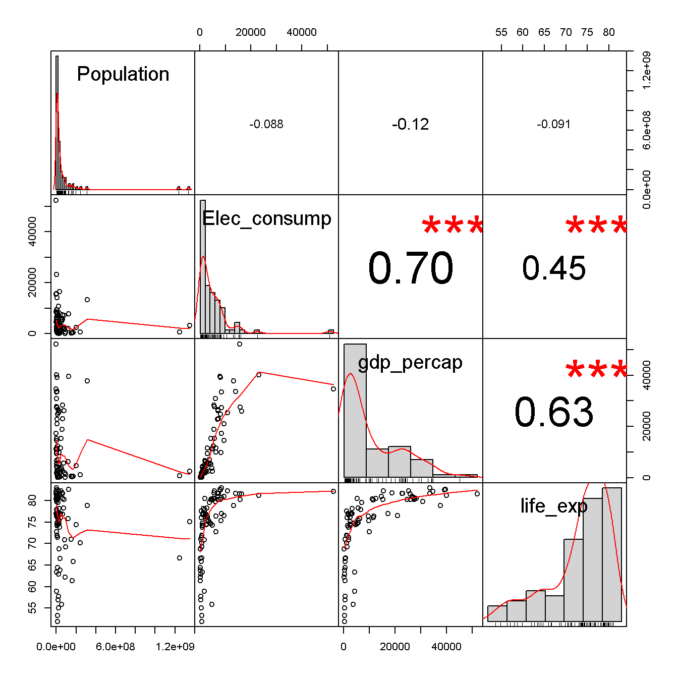
Figure 1: Correlation Plot - Year = 2011 by Country
This proves the hypothesis that greater economic activity aided by more power production and consumption leads to higher life expectancy in general. War leads to a reduction in Life Expectancy. For example in the case of Libya life expectancy reduced from 76 years in 2010 to 61 years in 2011
Conclusion
- GDP per capita, Electricity consumption & Life Expectancy are positively correlated to each other.
- In general, all three have increased from the year 1981 to the year 2011.
- China has seen the biggest increase in GDP, Life Expectancy and Electricity consumption.
- This is followed by other Asian countries like Thailand, India, Indonesia, Malaysia etc. India has to go a long way before catching up with China. Even though overall GDP of India is high (ranked 6th currently) GDP per capita which is an indication of standard of living is quite low. Life expectancy which is also an indication of standard of living is almost 7 years lower than China.
- South American countries see gains in GDP and resulting increase in Life Expectancy.
- Majority of the African countries appear to be still stagnating on the lower end of the spectrum. This might be due to civil and territorial wars in some of the countries studied. Africa is a very rich continent in terms of mineral and ecological wealth, but there are a lot of failed states and corrupt government which are preventing from unleashing economic growth.
- Luxemburg has the highest GDP per capita and Iceland the highest energy consumption per capita. Japan has the highest life expectancy.